

7 Common Costly Mistakesby Wirral Residential Buyers Book Cover Design
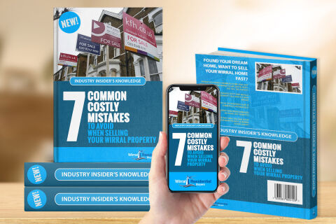
This portfolio showcase highlights the commercial jacket layout, digital cross platform optimisation and print architecture for the 7 Common Costly Mistakes to Avoid When Selling Your Wirral Property Book Cover Design. The objective was to design a highly professional, striking, and persuasive real estate guide cover that bridges regional property authority with strategic direct response marketing, instantly communicating transactional safety, landlord security and clear conversion paths.
Design & Requirements Breakdown
Visual Symbolism – The design features a realistic photography banner displaying multiple "For Sale" agency boards outside classic brick residential properties across the upper half of the canvas. This real estate theme is beautifully anchored into the graphic architecture via a stark white numeral "7" which acts as a primary visual focal point. This immediate typographic weight visually reinforces systemic property guidance, localised real estate coverage and corporate trade transparency.
Typographic Architecture – A bold, heavy sans-serif display typeface blocks out the primary headline "7 COMMON COSTLY MISTAKES TO AVOID WHEN SELLING YOUR WIRRAL PROPERTY" across stacked, left aligned rows. An explicit blue banner crowns the title segment reading "INDUSTRY INSIDER'S KNOWLEDGE," while a vibrant cyan circular badge reading "NEW!" commands the upper left corner to maximise retail shelf presence. Along the lower margin, clean white sans-serif typography maintains a highly precise alignment to feature the official "Wirral Residential Buyers" corporate logo emblem, keeping a lightweight information hierarchy optimised for effortless reading.
Premium Presentation – The promotional collateral is presented in a premium 3D digital and print mock up perspective showcasing a multi unit marketing arrangement resting on a smooth wooden tabletop backdrop. The front jacket stands vertically alongside a fanned pile of horizontal books to emphasise print production depth, while a central hand holds a modern smartphone displaying a matching mobile e-book interface. To the right, the reverse jacket configuration reveals back cover synopsis paragraphs, a secondary thumbnail illustration and a professional retail barcode layout to show full publishing readiness.
Strategic Colour Choice – A sophisticated, property first palette of deep slate blue, bright sky cyan and crisp white forms the core brand signature elements and graphic panels, heavily contrasted by the colourful tones of the property photography. This distinct, high contrast palette evokes immediate consumer trust, estate management logic and a highly recognisable local trade brand identity that cuts through traditional competition.
Target Audience Focus – The structured, solution first layout is tailored to engage independent residential property sellers looking for reliable transaction management, property investors seeking asset security, and local homeowners demanding transparent, highly professional advisory guidance during their property sales journey.