
Alp Joinery Woodwork Solutions Flyer Design
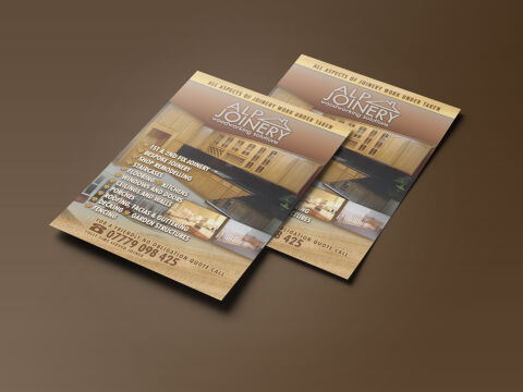
This portfolio showcase highlights the commercial print architecture and trade advertising layout for the Alp Joinery Woodworking Solutions flyer design. The objective was to design a highly professional, structured, and premium marketing flyer that bridges traditional trade craftsmanship with clean, modern graphic design, instantly communicating carpentry precision, architectural remodeling reliability and rapid telephone inquiry accessibility.
Design & Requirements Breakdown
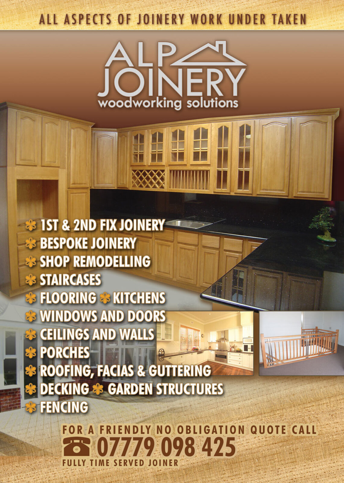
Visual Symbolism – The design features a stylised, minimalist roof line icon integrated directly above the elegant "ALP JOINERY" brand name, which crowns the upper canvas as the primary mark. This construction theme is beautifully echoed via a series of high quality internal architectural showcases, highlighting premium fitted kitchens, custom timber staircases, and bespoke storage installations, visually reinforcing artisanal joinery mastery, structural durability and brand transparency.
Typographic Architecture – A clean, modern sans-serif display typeface blocks out the company identity, accompanied by a smaller, refined sub tagline reading "woodworking solutions". In the centre left margin, an ultra legible white sans-serif list structures core capabilities such as "Bespoke Joinery", "Shop Re-modelling", and "Garden Structures" utilising distinct bulleted nodes. The lower wood textured canvas blocks out essential phone contact numbers alongside a welcoming consultation promise to keep a lightweight information hierarchy optimised for effortless reading by property owners.
Premium Presentation – The promotional collateral is presented in a premium 3D print mock up perspective showcasing a two page fanned arrangement with the front cover overlapping the secondary text canvas, casting realistic shadows on a deep, warm espresso studio backdrop. This dynamic composition accentuates the tactile print quality, precise margin alignments and crisp edge definitions, offering a realistic preview of a complete commercial marketing touch point.
Strategic Colour Choice – A sophisticated, craft first palette of rich mahogany browns, soft cream tones, and natural wood grains forms the core brand signature layout, heavily punctuated by clean white typography blocks. This distinct, earth toned palette evokes immediate consumer trust, traditional woodworking logic, and a highly recognisable trade brand identity that stands out from standard, low contrast domestic competitor layouts.
Target Audience Focus – The structured, service first layout is tailored to engage premium residential homeowners looking for custom domestic cabinetry upgrades, commercial business owners seeking high end retail shopfitting solutions, and main building contractors demanding a transparent, highly professional carpentry partnership.