

Armson Electrical Services Ltd Stationary Design
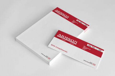
This portfolio showcase highlights the corporate identity layout and print asset coordination for the Armson Electrical Services Ltd Business Stationery. The objective was to design a clean, highly authoritative, and professional stationary that bridges industrial trade engineering with corporate credibility, instantly communicating operational safety, technical compliance, and trusted electrical service.
Design & Requirements Breakdown
Visual Symbolism – The design relies on structured, geometric block elements and official industry accreditation logos positioned along the right side of the main crimson header. These regulatory badges visually reinforce technical compliance, verified safety standards, and certified trade excellence, while the solid, clean canvas emphasises organised professionalism and precision engineering.
Typographic Architecture – A dominant, high contrast serif typeface proudly presents the company name "ARMSON" in a striking white font, grounded by a clean sans-serif secondary block for "ELECTRICAL SERVICES LTD." On the matching "With Compliments" slip, a classic, elegant cursive script delivers the phrase "With Compliments" in contrasting crimson red across the lower white writing area, keeping a lightweight information hierarchy optimised for quick scanning and corporate identification.
Premium Presentation – The stationery collection is showcased in a premium 3D stacked print mock up composition resting on a crisp, neutral studio backdrop. This isometric perspective highlights a substantial pad of official corporate letterhead paired with a matching compliment slip overlapping the lower right hand quadrant, demonstrating a polished, professional business suite optimised for trade invoicing, commercial service contracts, and executive correspondence.
Strategic Colour Choice – A vibrant, high visibility crimson red serves as the core brand signature, forming the commanding full bleed header blocks. This bold colour choice is heavily contrasted by a crisp white paper writing canvas, stark white branding text, and a deep charcoal grey for the formal business footer rules. This classic, high contrast palette evokes immediate operational trust, industrial energy, and an easily recognisable trade identity.
Target Audience Focus – The structured, service first layout is tailored to engage commercial building managers seeking reliable engineering contractors, industrial project coordinators requiring certified electrical infrastructure teams, and private residential clients demanding safe, professional, and fully accredited electrical servicing.