

Frost Of Exeter Estate Agency Flyer Design
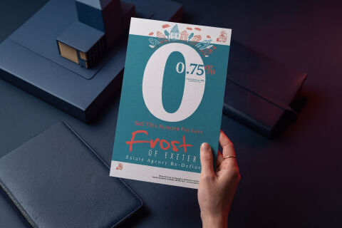
This portfolio showcase highlights the commercial print architecture and advertising layout for the Frost of Exeter Estate Agency flyer design. The objective was to design a highly professional, striking, and approachable regional marketing flyer that bridges boutique real estate authority with clean, modern graphic design, instantly communicating competitive fee advantages, localised market reliability and structured business communication.
Design & Requirements Breakdown
Visual Symbolism – The design features a charming, hand drawn whimsical crown of stylised houses, trees and clouds in a warm coral tint that sits beautifully atop a massive "0" glyph. This architectural structure is integrated seamlessly into the central canvas, visually reinforcing domestic communities, neighborhood warmth, regional property markets and brand transparency.
Typographic Architecture – A bold, clean custom script typeface blocks out the name "Frost" in a vibrant coral orange font, accompanied by a structured sans-serif display layout reading "OF EXETER" and the tagline "Estate Agency Re-Defined". To emphasise the agency's competitive financial advantage, a massive, stark white sans-serif "0" dominates the upper half of the flyer, nestled beside a smaller, precise ".75%" fee indicator and a "Grand Opening Offer" caption, keeping a lightweight information hierarchy optimised for effortless reading from a distance.
Premium Presentation – The promotional collateral is presented in a flat, high definition layout utilising a crisp vertical flyer format with balanced, expansive margins. This clean composition showcases a dedicated white footer strip running along the bottom margin, providing a tidy and unobtrusive space for legal text clarifications and double commission warnings to anchor the main framework.
Strategic Colour Choice – A sophisticated, professional palette of deep teal aquamarine forms the core brand signature background canvas, heavily contrasted by the giant white numbers and energetic pops of warm coral pink for the primary text elements. This distinct, high contrast palette evokes immediate consumer trust, localised friendly appeal, and a clean, recognisable estate agency brand identity that cuts through traditional, corporate competitor styling.
Target Audience Focus – The structured, value first layout is tailored to engage independent residential property sellers looking for lower commission rates in the local area, prospective home movers seeking a modern, redefined real estate experience, and Exeter regional residents demanding transparent, highly professional and competitively priced property consultations.