Heated Water Logo Design
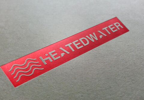
This portfolio showcase highlights the brand identity development for HEATEDWATER, a modern service provider specialising in premium heating and water solutions. The objective was to design a clean, authoritative, and instantly recognisable emblem that seamlessly communicates the core business functions of temperature control and fluid dynamics.
Design & Requirements Breakdown
Visual Symbolism - The icon integrates three fluid, stacked waves that simultaneously evoke water currents and rising heat ripples.
Typographic Architecture - A bold, geometric, sans-serif typeface in all caps establishes a foundation of structural stability and industrial reliability.
Premium Presentation - The final deliverable transitions from a digital concept into tangible media using hot foil stamping, embedding silver embossed typography onto a striking crimson block.
Strategic Colour Choice - Crimson red is used to immediately signify thermal heat and energy, while the metallic silver typography adds an industrial sense of premium craftsmanship and reliable technology.
Target Audience Focus - The geometric precision and high end foiled finish are tailored to attract commercial property developers and premium residential clients who value premium, trusted engineering.