

I Am David Wright - This Is Me Autobiography Book Cover Design
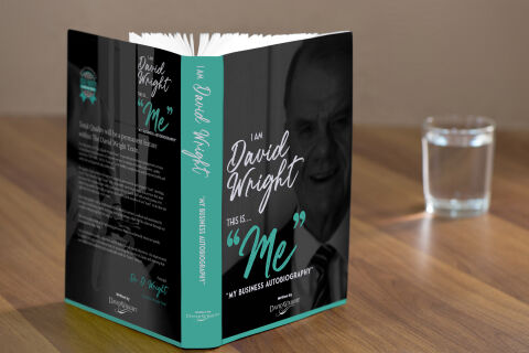
This portfolio showcase highlights the commercial jacket layout and print jacket architecture for the I Am David Wright – This Is... "Me" My Business Autobiography Book Cover Design. The objective was to design a highly professional, striking, and intimate book jacket that bridges executive business authority with candid personal memoir, instantly communicating leadership legacy, corporate transparency and a compelling narrative that commands presence on retail shelves and digital storefronts.
Design & Requirements Breakdown
Visual Symbolism – The design features a stylised, high contrast monochrome photographic portrait of David Wright that dominates the right canvas, establishing immediate personal connection and executive gravitas. This autobiographical theme is beautifully layered via a fanned row of crisp teal quotation marks enclosing the word "Me", while the reverse panel mirrors the duo tone portrait styling alongside corporate accreditation badges, visually reinforcing a trust backed corporate history and an authentic, open book narrative style.
Typographic Architecture – An elegant, flowing white cursive font blocks out the introductory statement "I Am David Wright" across the centre, paired with a matching weighted cursive layout reading "This Is..." directly underneath. The core title word "Me" commands the centre of the cover in a bold, stylised cyan teal script font accented by oversized quote marks, while the subtitle and author attribution blocks maintain a highly precise, clean sans-serif alignment to keep a lightweight information hierarchy optimised for effortless reading.
Premium Presentation – The promotional asset is presented in a premium 3D book mock up perspective showcasing a reader volume standing wide open on a smooth, warm wooden tabletop backdrop beside a clear water glass. This realistic composition emphasises mass print production quality, authentic paperback page block volume, and real world handling depth, offering a highly tactile preview of the front cover, the matching teal spine architecture, and the informative back jacket summary.
Strategic Colour Choice – A sophisticated, professional palette of deep slate black and muted charcoal forms the core brand signature canvas, heavily punctuated by energetic pops of vibrant cyan teal along the spine, borders, and main title accents. This distinct, high contrast palette evokes immediate corporate trust, contemporary executive logic, and a clean, highly recognisable personal brand identity that stands out from typical business biographies.
Target Audience Focus – The structured, legacy first layout is tailored to engage aspiring entrepreneurs looking for real world leadership strategies, corporate professionals seeking insight into business development history, and non-fiction readers demanding an engaging, transparent, and highly professional breakdown of an executive life journey.