

Kara Si Lingerie Flyer Design
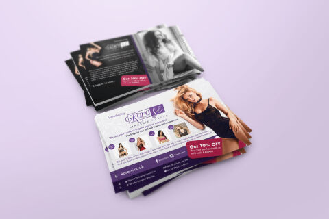
This portfolio showcase highlights the marketing layout and promotional print asset design for the Kara-Si Lingerie flyer. The objective was to design a highly professional, luxurious, and seductive promotional flyer that bridges intimate apparel e-commerce with direct to consumer print marketing, instantly communicating garment premiumisation, brand sophistication, and an optimised conversion funnel built to capture consumer attention.
Design & Requirements Breakdown
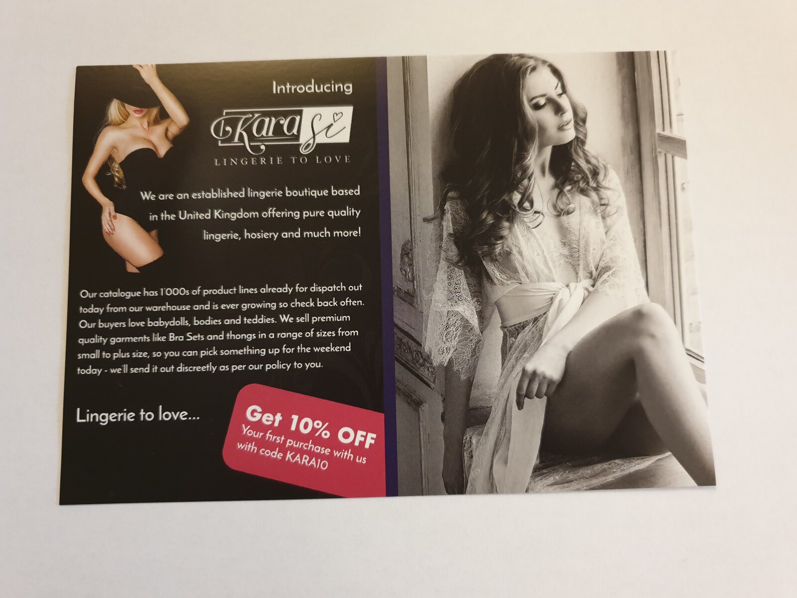
Visual Symbolism – The design features a beautifully integrated multi photo composition, dominated by a large, high resolution lifestyle portrait of a model modeling an elegant black lace piece on the primary front panel. This editorial fashion theme is mirrored seamlessly across the layout via a fanned row of smaller, circular product catalog thumbnails showcasing distinct styles, while the accompanying reverse side utilises a striking, high fashion monochrome boudoir photograph, visually reinforcing sartorial intimacy, premium material textures and brand authenticity.
Typographic Architecture – An elegant, flowing cursive brand mark blocks out the "Kara-Si" logo centerpiece inside a dedicated white canvas frame, anchored by a smaller, structured serif sub tagline reading "LINGERIE LOUNGE". The body copy utilises a clean, modern sans-serif typeface to maintain maximum readability, while an aggressive, slanted magenta call out tab cuts across the lower right quadrant to announce an immediate "Get 10% Off" incentive alongside a dedicated "KARA10" promotional code, keeping a lightweight information hierarchy optimised for quick digital conversion.
Premium Presentation – The promotional collateral is presented in a premium 3D print mock up perspective showcasing a dual sided, overlapping stacked arrangement with a fanned pile of the white informative front side resting atop the deep charcoal reverse canvas, all set against a soft, pastel lavender studio backdrop. This composition emphasises mass print production quality, dual sided layout continuity and clean margin configurations, offering a highly tactile preview of a luxury unboxing package insert.
Strategic Colour Choice – A sophisticated, fashion forward palette of deep royal purple, rich charcoal black, and crisp white forms the core brand signature canvas, heavily punctuated by energetic pops of hot magenta pink for the primary discount triggers and actionable marketing blocks. This distinct, high contrast palette evokes immediate consumer trust, contemporary retail logic and an alluring, highly recognisable luxury boutique brand identity that stands out in a parcel shipment.
Target Audience Focus – The structured, retention first layout is tailored to engage trend conscious digital shoppers looking for high quality intimate apparel, gift buyers seeking a premium and reliable boutique brand experience, and e-commerce consumers demanding a seamless transition from a physical unboxing touch point to an online digital storefront.