

Maid 2 Clean Home Cleaning Services Flyer Design
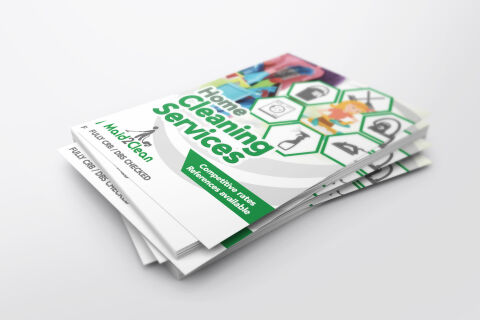
This portfolio showcase highlights the commercial print architecture and multi unit advertising layout for the Maid 2 Clean Home Cleaning Services flyer design. The objective was to design a highly professional, pristine, and modern promotional flyer that bridges franchise service authority with clear, high impact marketing, instantly communicating domestic precision, trust backed reliability, and structured business communication.
Design & Requirements Breakdown
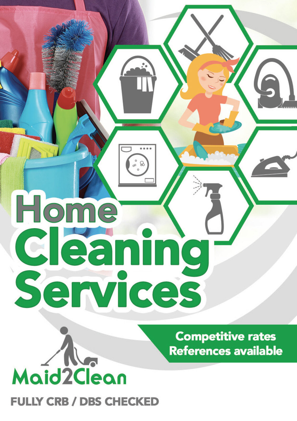
Visual Symbolism – The design features a structured matrix of green hexagonal icon nodes on the right canvas, neatly framing individual household cleaning themes like laundry, vacuuming, and ironed garments alongside a friendly character illustration. This geometric structure is echoed beautifully across the background canvas via large, fluid, sweeping grey curves that cut dynamically through the center margins, visually reinforcing systematic cleaning paths, domestic order and corporate transparency.
Typographic Architecture – A bold, punchy sans-serif display typeface blocks out the primary service announcement "Home Cleaning Services" in a vibrant grass green, dominating the upper central layout. On the left margin, the official stylised "Maid 2 Clean" franchise brand mark establishes immediate corporate validity. Below the main text, a lightweight sans-serif font maintains a precise alignment inside a sharp green banner to emphasise key value propositions such as "Competitive rates" and "References available" keeping a lightweight information hierarchy optimised for effortless reading by busy homeowners.
Premium Presentation – The promotional collateral is presented in a premium 3D print mock up perspective showcasing a thick, overlapping stacked pile of printed flyer sheets resting at a dynamic angle on a clean white studio backdrop. This composition emphasises mass print production quality, authentic paper edge definitions, and repetitive brand exposure, offering a highly tactile and immersive preview of a completed direct mail marketing asset.
Strategic Colour Choice – A sophisticated, cleanliness first palette of grass green and soft slate grey forms the core brand signature elements and graphic blocks, heavily contrasted by a crisp white paper writing canvas and the multi coloured interior icon details. This distinct, high contrast palette evokes immediate domestic trust, hygiene logic, and a highly recognisable local trade brand identity that cuts through traditional competition.
Target Audience Focus – The structured, service first layout is tailored to engage busy residential homeowners looking for dependable domestic maintenance, commercial property landlords seeking a reliable tenancy deep clean partnership, and local families demanding transparent, highly professional, and fully vetted cleaning trade communication.