
Nail Gaga Festive Season Nail Colours Flyer Design
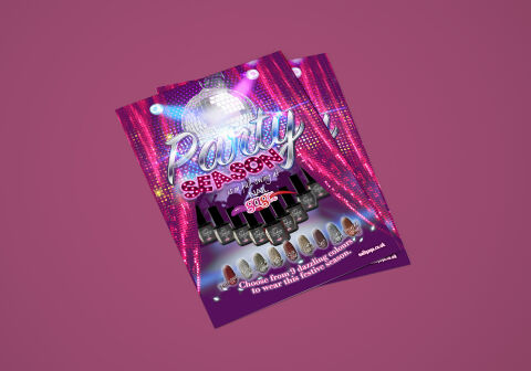
This portfolio showcase highlights the marketing layout and seasonal print asset design for the Nail Gaga Festive Season flyer. The objective was to design a highly professional, glamorous, and electrifying promotional flyer that bridges professional beauty services with high impact entertainment graphics, instantly communicating cosmetic trend leadership, product premiumisation and structured festive marketing appeal.
Design & Requirements Breakdown
Visual Symbolism – The design features a massive, reflective 3D disco ball illuminated by bright theater spotlights, framed elegantly by a pair of sparkling, magenta sequined stage curtains that flank the outer margins. This nightlife theme is beautifully integrated with a symmetric chevron formation of premium gel nail polish bottles in the centre foreground, while a diverse row of nine textured, glitter infused acrylic nail templates lines the base, visually reinforcing party ready aesthetics, professional salon application, and brand transparency.
Typographic Architecture – A dramatic, metallic liquid chrome cursive typeface blocks out the primary headline "Party" across the upper half, paired with a matching weighted, marquee light display font reading "SEASON". Nestled neatly in the centre is the distinct "NAIL gaga" corporate logo, featuring integrated nail stroke icons. Below the primary layout, an ultra legible, high contrast white sans-serif typeface details the "Choose from 9 dazzling colours" promotional directive, keeping a lightweight information hierarchy optimised for effortless reading beneath dim retail or lounge lighting.
Premium Presentation – The promotional collateral is presented in a flat, high definition layout utilising an immersive full bleed vertical flyer format. This sharp graphic composition showcases deep atmospheric lighting filters, realistic glitter textures, and complex gradient masking across the text frames, offering a polished, highly sensory preview of a complete holiday retail touch point.
Strategic Colour Choice – A sophisticated, ultra vibrant palette of deep plum, neon magenta, and hot pink forms the core brand signature canvas, heavily contrasted by the bright white spotlight beams and the rich, metallic silver reflections of the disco graphics. This distinct, high impact palette evokes immediate festive celebration association, luxury cosmetic logic, and a clean, recognisable salon brand identity that stands out in a crowded counter display.
Target Audience Focus – The structured, product first layout is tailored to engage fashion forward salon clients seeking eye catching holiday nail treatments, professional nail technicians looking to stock the latest seasonal gel colour collections and beauty distributors demanding transparent, highly professional, and emotionally engaging retail marketing collateral.