

Pc Fix It 4 U Data Backup Solutions Flyer Design
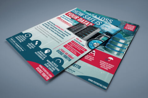
This portfolio showcase highlights the commercial print architecture and business to,business marketing layout for the PC Fix It 4 U Data Backup Solutions flyer design. The objective was to design a highly professional, striking, and technically authoritative promotional flyer that bridges corporate IT security with high impact marketing, instantly communicating data protection precision, network reliability and structured business communication paths.

Design & Requirements Breakdown
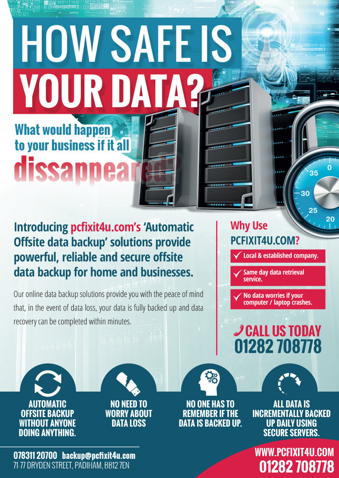
Visual Symbolism – The design features a beautifully rendered, multi layered digital collage on the right canvas, combining a realistic server rack array with a high security dial lock and a sleek 3D database storage cylinder. This cybersecurity theme is mirrored across the background via subtle digital matrix overlays and sweeping curves that cut dynamically across the layout. This visual architecture divides the canvas into clean, thematic content zones that intuitively communicate cloud architecture, secure firewalls and absolute data protection.
Typographic Architecture – An ultra bold, heavy sans-serif display typeface blocks out the primary question "HOW SAFE IS YOUR DATA?" in a vibrant crimson red and deep azure blue, instantly commanding attention across the header area. The body layout utilises highly precise left alignments for technical information panels, separating service advantages into bite sized, readable chunks. Key brand benefits are reinforced through clean corporate iconography such as a security umbrella, cloud arrows, and an automated gear symbol, while the bottom margin blocks out telephone links and the official "PCFIXIT4U.COM" url in a stark white font to keep the information hierarchy lightweight and optimised for rapid business reading.
Premium Presentation – The promotional collateral is presented in a premium 3D print mock up perspective showcasing a two page fanned, overlapping stacked arrangement resting at a dynamic angle on a neutral, soft slate grey studio backdrop. This composition emphasises mass print production quality, dual sided layout continuity, and clean margin configurations, offering a highly tactile and professional preview of a B2B trade counter touch point or direct mail asset.
Strategic Colour Choice – A sophisticated, technology first palette of deep slate blue, bright cyan, and vibrant crimson red forms the core brand signature elements and graphic banners, heavily contrasted by a crisp white paper writing canvas. This distinct, high contrast palette evokes immediate corporate trust, technical logic and a highly recognisable local IT support brand identity that stands out on a busy office desk.
Target Audience Focus – The structured, solution first layout is tailored to engage local small business owners looking to safeguard sensitive client records, corporate network managers seeking automated offsite backup infrastructure and residential users demanding transparent, highly professional emergency IT consultation.