

Scruffs 2 Crufts Dog Grooming Flyer Design
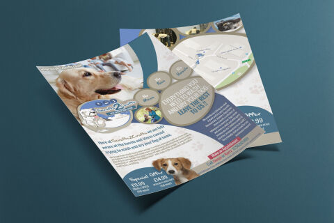
This portfolio showcase highlights the commercial print architecture and advertising layout for the Scruffs 2 Crufts Self-Service Dog Wash flyer design. The objective was to design a highly professional, inviting, and playful marketing flyer that bridges professional pet care utility with approachable graphic design, instantly communicating convenience, stress free grooming solutions and structured business communication.
Design & Requirements Breakdown
Visual Symbolism – The design features a large, high fidelity lifestyle image of a clean, happy Golden Retriever dominating the upper left canvas, framing the home like family context in a soft background blur. This canine theme is beautifully structured into the graphic architecture via a massive paw print layout that sweeps across the right side of the canvas. The individual toe pads elegantly frame core service benefits "No Mess", "No Fuss", and "No Hassle" while a central circular photography mask captures a localised outdoor dog walking interaction, visually reinforcing outdoor adventure leading directly into a practical cleanup solution.
Typographic Architecture – A playful, customised cursive logo blocks out the name "Scruffs 2 Crufts" alongside an illustrated cartoon sheepdog emblem, anchored neatly inside a dedicated blue brand badge. The main marketing copy utilises a bold, heavy sans-serif display typeface inside the paw motif to declare the primary value proposition: "EVERYTHING YOU NEED TO WASH AND DRY YOUR DOG". In the lower footer, ultra legible high contrast sans-serif fonts balance vital pricing metrics, promotional "Special Offer" categories, and an immediate telephone call to action to keep a lightweight information hierarchy optimised for effortless reading by busy pet owners.
Premium Presentation – The promotional collateral is presented in a flat, high definition layout utilising balanced text margins and structured organic shapes to blend multiple photographic, vector, and informational elements into a cohesive graphic canvas. This clean composition showcases a dedicated white and blue section break, utilising subtle background paw print watermarks to anchor the design framework while maintaining a friendly, community focused trade appeal.
Strategic Colour Choice – A sophisticated, pet friendly palette of deep royal blue, warm sandy browns, and soft sky blue forms the core brand signature backgrounds and geometric frames, heavily contrasted by a crisp white canvas and an energetic pop of crimson red for the primary scheduling instructions. This distinct, high contrast palette evokes immediate consumer trust, domestic hygiene logic and a highly recognisable local pet care brand identity that stands out on a community noticeboard.
Target Audience Focus – The structured, convenience first layout is tailored to engage everyday dog owners looking to avoid the mess of home bathing, active pet parents seeking a stress free self service grooming alternative, and local residents demanding transparent, friendly, and highly reliable trade counter services that cater specifically to their pets' wellness needs.