

Hurstwood Hall Guest House Vacancy Flyer Design
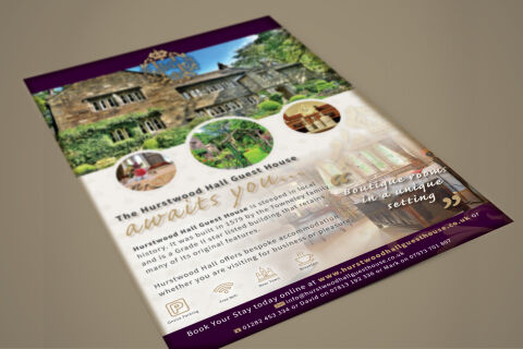
This portfolio showcase highlights the hospitality print architecture and promotional asset layout for The Hurstwood Hall Guest House promotional flyer design. The objective was to design a highly professional, elegant, and welcoming tourism flyer that bridges heritage boutique hospitality with structured graphic design, instantly communicating historical prestige, luxury accommodations and clear booking accessibility.
Design & Requirements Breakdown
Visual Symbolism – The design features a breathtaking, full bleed landscape photograph of the historic stone manor house that dominates the upper half of the canvas, instantly anchoring the estate's architectural grandeur. This heritage theme is beautifully layered with an ornate, golden royal crest emblem crowning the top center. Below the main house, a trio of circular photographic vignettes showcases intimate interior dining, lush garden pathways, and premium vintage room accents, visually reinforcing bespoke guest experiences, scenic countryside tranquility and brand transparency.
Typographic Architecture – A clean, modern sans-serif display typeface blocks out the primary name "The Hurstwood Hall Guest House," accompanied by a fluid, elegant cursive script tagline reading "awaits you..." in a soft gold tone. The main body narrative uses a highly legible, weighted sans-serif font to outline the property's rich 1579 history, while an atmospheric, stylised cursive call out statement is nestled inside quotation marks on the lower right image canvas. Along the base, a row of minimalist vector line icons denotes essential guest amenities such as free parking, Wi-Fi, and breakfast, keeping a lightweight information hierarchy optimised for effortless reading by travelers.
Premium Presentation – The promotional collateral is presented in a flat, high definition layout utilising an immersive multi image canvas. This clean composition showcases a seamless blend of historical architecture and modern marketing hierarchy, integrating a subtle, low opacity crest watermark over the cream textured background canvas to frame the textual details elegantly.
Strategic Colour Choice – A sophisticated, premium palette of deep royal purple and metallic gold forms the core brand signature footer and decorative elements, heavily contrasted by a soft, warm cream paper canvas and vibrant, natural stone and foliage photographic tones. This distinct, high contrast palette evokes immediate luxury trust, historical authenticity, and a highly recognisable boutique hospitality brand identity that stands out in a regional tourism display.
Target Audience Focus – The structured, heritage first layout is tailored to engage luxury weekend travelers seeking a historic countryside escape, business professionals looking for a bespoke alternative to corporate hotels and international tourists demanding transparent, premium, and character rich accommodations during their travels.