

The Oxfordshire Property Agent Logo Design
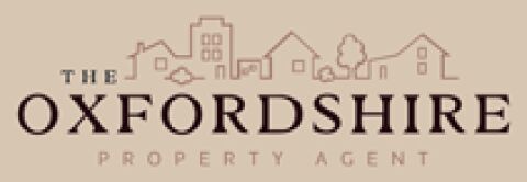
This portfolio showcase highlights the brand identity development for The Oxfordshire Property Agent. The objective was to design a warm, boutique, and sophisticated emblem that instantly communicates regional expertise, community focused values, and a trusted, high-end approach to property sales and lettings.
Design & Requirements Breakdown
Visual Symbolism - The icon features a delicate, continuous line illustration of a village street scene, combining varied residential houses and greenery to symbolise community warmth, architectural diversity, and local roots.
Typographic Architecture - A classic, high contrast serif typeface is utilised for "OXFORDSHIRE" to establish immediate regional authority and prestige, balanced by a clean, widely spaced sans-serif font for the underlying title.
Premium Presentation - The balanced, symmetrical layout stacks the elegant line art sketch cleanly above the typography, ensuring a refined, uncluttered presentation on property brochures, high street signage, and digital platforms.
Strategic Colour Choice - A deep, sophisticated chocolate brown is paired with soft terracotta outlines against a warm, neutral stone backdrop to evoke timeless elegance, dependability, and an inviting home environment.
Target Audience Focus - The artisan, boutique aesthetic is carefully tailored to appeal to independent home sellers, premium buyers, and landlords seeking a highly personalised, trusted, and professional estate agency service.