
Tweezers Beauty Salon Treatment Menu Design
This portfolio showcase highlights the editorial layout, panel architecture, and typography execution for the Tweezers Beauty Salon Treatment Menu & Price List. The objective was to design a charming, highly organised, and elegant multi panel menu brochure that bridges boutique wellness vibes with professional service marketing, instantly communicating salon luxury, a comprehensive treatment selection, and structured pricing navigation.
Design & Requirements Breakdown
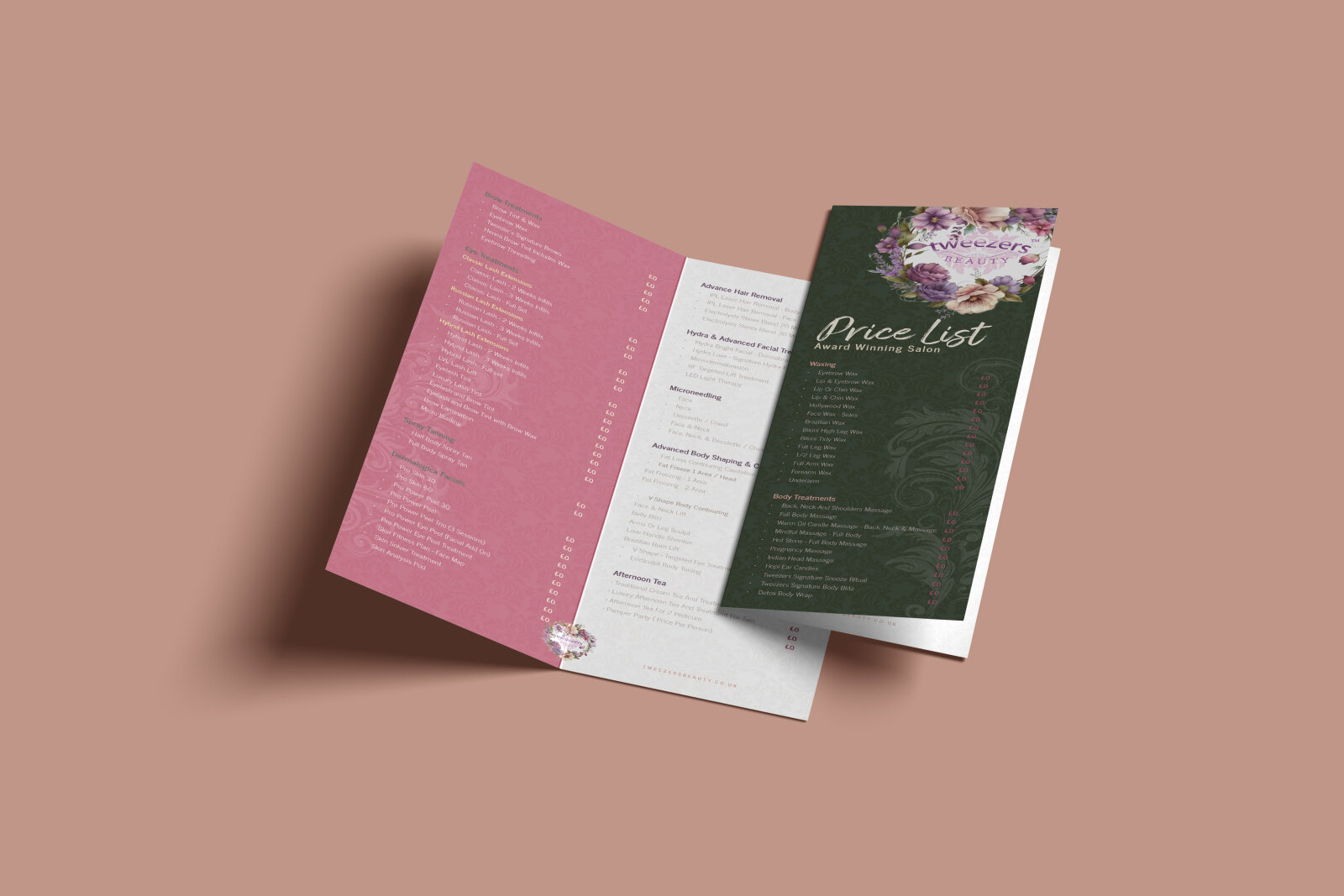
Visual Symbolism – The design features a delicate, whimsical botanical theme crowned by an intricate floral bouquet illustration of soft pastel peonies, roses, and lush greenery that frames the central "Tweezers Beauty" brand emblem. A subtle, tone on tone lace watermark motif sweeps across the dark textured backgrounds, visually reinforcing professional indulgence, meticulous care, and artistic cosmetic detail.
Typographic Architecture – An elegant, high contrast cursive script delivers the "Price List" header across the cover with an inviting, artistic flair. This is beautifully balanced internally by a clean, lightweight sans-serif typeface that methodically organises extensive treatment menus such as Waxing, Body Treatments, Dermatological Facials, and Eye Treatments into parallel columns with right aligned dot leaders for flawless pricing legibility.
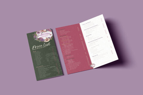
Premium Presentation – The multi page fold out menu brochure is showcased in an elegant 3D print mock up perspective, displaying both the closed front of panel cover art and the expansive multi page internal spread. This layout presentation emphasises the balanced panel widths, clean trim boundaries, and smooth typography mapping optimised for reception desks, client waiting tables, and direct marketing mailers.
Strategic Colour Choice – A sophisticated, organic palette features a deep sage green cover canvas, transitioning into a rich berry rose wine interior accent panel, and concluding with a clean, high contrast white text layout. This earthy yet glamorous colour scheme evokes calming relaxation, botanical skin safety, and an upscale, premium boutique brand identity.
Target Audience Focus – The elegant, care first menu layout is tailored to engage discerning beauty salon patrons looking for high end skincare treatments, bridal parties mapping out wedding grooming regimens, and everyday retail customers seeking an indulgent, clearly mapped self care experience.