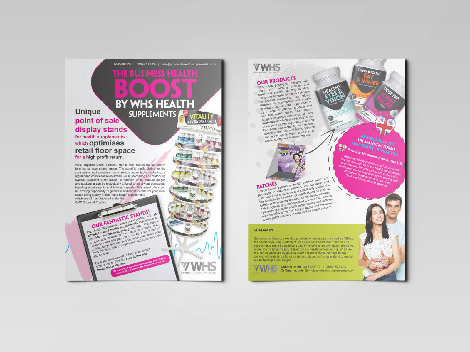

Whs Supplements Flyer Design
This portfolio showcase highlights the commercial print architecture and B2B marketing layout for the WHS Health Supplements flyer design. The objective was to design a highly professional, energetic, and informative promotional flyer that bridges clinical wellness authority with high impact corporate marketing, instantly communicating retail solution precision, point of sale reliability, and structured commercial partner communication.
Design & Requirements Breakdown
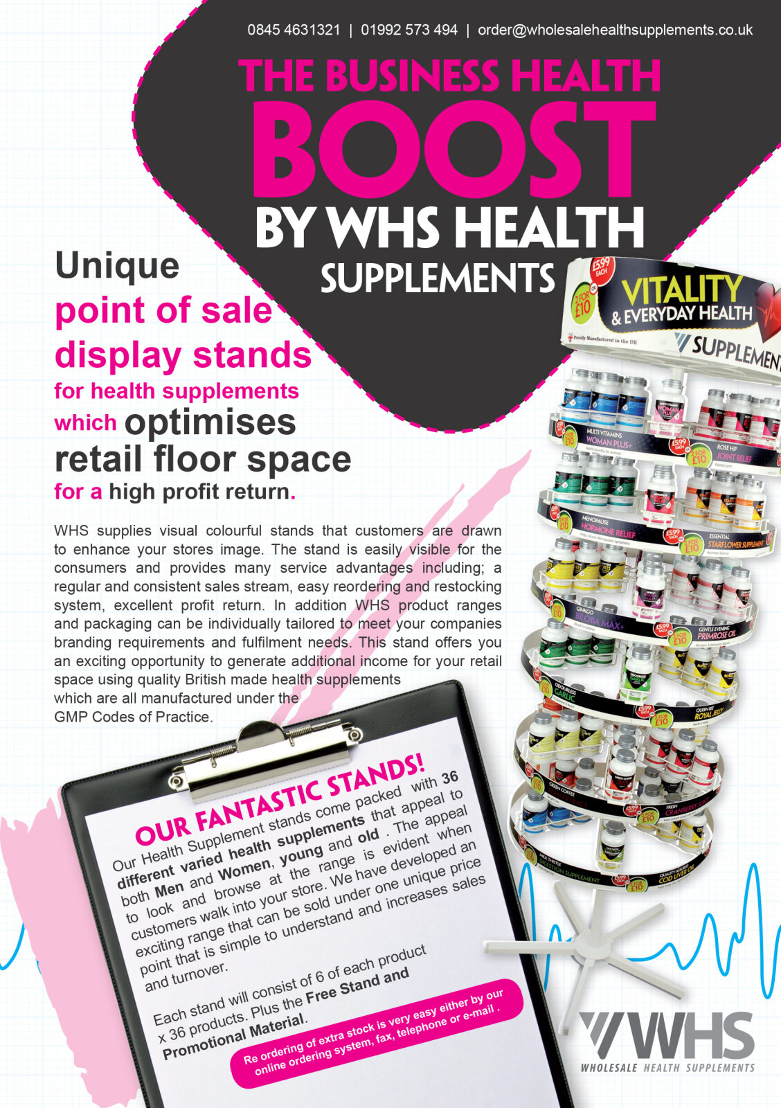
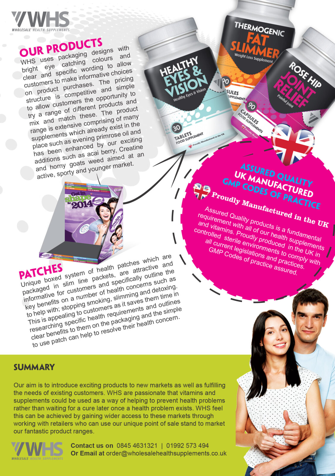
Visual Symbolism – The design features a realistic, multi tiered circular point of sale display stand mock up layered alongside a stylised corporate clipboard graphic that dominates the lower central foreground. This retail theme is beautifully anchored across the layout via realistic 3D supplement bottle renders ("Fat Slimmer", "Healthy Eyes") crowning the upper margins of the reverse panel, visually reinforcing nutritional product variation, turnkey floor space optimisation and manufacturing transparency.
Typographic Architecture – A bold, blocky sans-serif display typeface blocks out the primary campaign headline "THE BUSINESS HEALTH BOOST" across a dark, angled graphic header, utilising an alternating white and high visibility magenta colour hierarchy. Across both the front and reverse panels, clean sans-serif typefaces maintain a highly precise alignment, balancing technical retail benefit paragraphs, bulleted product category features, and essential corporate contact paths to keep a lightweight information hierarchy optimised for rapid reading by busy business owners.
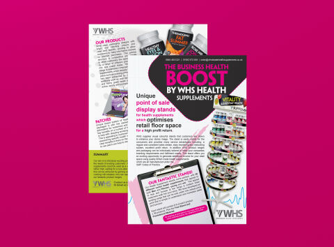
Premium Presentation – The promotional collateral is presented in a premium 3D print mock up perspective showcasing a two page fanned arrangement with the front cover overlapping the detailed reverse product canvas, resting at a dynamic angle on a vibrant magenta studio backdrop. This composition emphasises mass print production quality, authentic dual sided layout continuity, and clean margins, offering a highly tactile preview of a complete commercial marketing touch point.
Premium Presentation – The promotional collateral is presented in a premium 3D print mock up perspective showcasing a two page fanned arrangement with the front cover overlapping the detailed reverse product canvas, resting at a dynamic angle on a vibrant magenta studio backdrop. This composition emphasises mass print production quality, authentic dual sided layout continuity, and clean margins, offering a highly tactile preview of a complete commercial marketing touch point.
Target Audience Focus – The structured, solution first layout is tailored to engage independent pharmacy owners looking for high margin floor display options, health food retail managers seeking automated point of sale merchandising solutions and corporate supplement distributors demanding transparent, highly professional B2B trade communications.