
Wonderfully Made Beauty Therapist Price List Flyer Design
This portfolio showcase highlights the commercial print architecture and service menu layout for the Wonderfully Made Beauty Freelance Beauty Therapist Price List flyer design. The objective was to design a highly professional, serene, and organic marketing flyer that bridges holistic wellness aesthetics with structured graphic design, instantly communicating therapeutic precision, natural skin care reliability, and organised treatment pricing.
Design & Requirements Breakdown
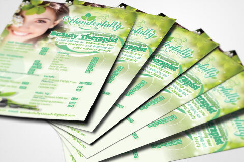
Visual Symbolism – The design features a radiant lifestyle photography portrait of a woman adorned with fresh white blossoms, anchoring the upper left corner. This botanical theme is echoed beautifully across the background canvas via soft, out of focus green foliage overlays, floating leaf elements, and subtle white abstract geometric circles woven into the margins, visually reinforcing organic ingredient logic, natural facial rejuvenation and brand transparency.
Typographic Architecture – An elegant, flowing cursive brand mark blocks out the name "Wonderfully Made Beauty" inside a stylised green banner framework at the top header. Directly below this, a clean, modern sans-serif display typeface announces the "Freelance Beauty Therapist" role, paired with an intimate italic personal mission statement. The central and lower margins utilise a highly precise column grid alignment to list individual treatment pricing across multiple categories such as Waxing, Facials, and Make Up, balancing bold labels with light price points to keep a lightweight information hierarchy optimised for effortless menu reading.
Premium Presentation – The promotional collateral is presented in a premium 3D print mock up perspective showcasing a fanned, overlapping stack of printed price lists resting at a dynamic angle on a crisp white studio backdrop. This composition emphasises mass print production quality, authentic edge definition, and repetitive brand exposure, offering a highly tactile preview of an salon counter display or direct to consumer promotional handout.
Strategic Colour Choice – A sophisticated, nature inspired palette of vibrant leaf green, soft sage, and refreshing mint tones forms the core brand signature background, heavily contrasted by a crisp white canvas and clean white text highlights. This distinct, organic palette evokes immediate consumer trust, therapeutic freshness, and a highly recognisable botanical brand identity that stands out from clinical or industrial competition.
Target Audience Focus – The structured, service first layout is tailored to engage local residents looking for personalised, at home wellness treatments, busy bridal parties seeking a dedicated freelance makeup artist, and health conscious skincare clients demanding a transparent, highly professional breakdown of holistic beauty enhancements.