
Wooden Leisure Ltd Logo Design
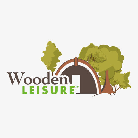
This portfolio showcase highlights the brand identity development for Wooden Leisure LTD. The objective was to design an organic, inviting, and natural emblem that instantly captures the essence of outdoor hospitality, glamping, and high quality timber leisure structures.
Design & Requirements Breakdown
Visual Symbolism -The icon integrates an illustrative, arched glamping pod or timber cabin silhouette nestled amongst a diverse grove of woodland trees to directly represent outdoor accommodation and nature escapes.
Typographic Architecture - A classic, earth toned serif typeface for "Wooden" establishes a grounded sense of rustic heritage, while the clean, bold sans-serif font for "LEISURE" adds a modern, recreational energy.
Premium Presentation - The multi-layered vector illustration uses clean overlapping shapes and organic contours, giving the digital design an approachable, friendly, and deeply scenic depth.
Strategic Colour Choice - A natural palette of leafy greens, olive tones, and warm timber browns is used to instantly evoke forests, sustainable wood materials, and peaceful outdoor environments.
Target Audience Focus - The friendly, scenic composition is carefully tailored to attract holidaymakers seeking premium staycations, nature lovers, and landowners looking for high quality glamping developments.